Our minds are constantly processing and consuming large amounts of information daily and as a result in can be difficult to step out from amongst what many see as monotony. When designing a poster, not only does it need to be informative, but it should grab the eye to fulfil your objective.
Have a read of some of some hints and tips that could make all the difference:
COLOURS
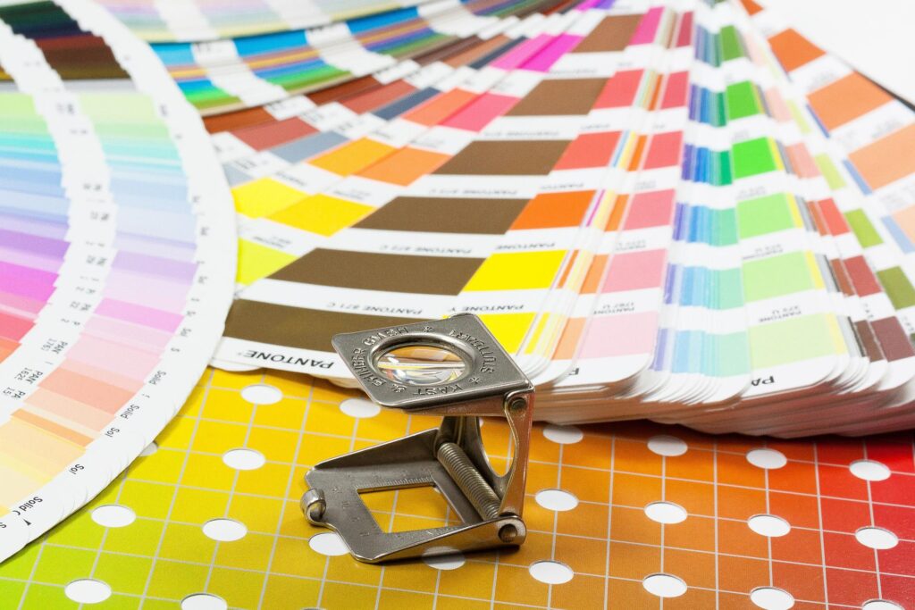
Simple sells. Choose a maximum of three colours that complement each other rather than a whole range that will instead clash and confuse. Placing dark text against a light background guarantee that your poster is easily visible. Always have the colour blind in mind by making sure that you don’t place green and red next to one another.
GRAPHICS
Too much text can be intimidating and so graphics can be used to break things up. If you’re able to find a way of representing text with a graphic, give that a try.
SPACING
When it comes to using space, it’s important to make sure there is enough around your content to ensure it’s easy to read. Spacing a poster in a way that’s kind to the eye allows the reader to take their time understanding the message.
SYMMETRY
There’s nothing more aesthetically pleasing than symmetry. Bear in mind the rule of thirds when setting everything together to make sure there isn’t one side unnecessarily heavy with content.
KEY DETAILS
It may seem obvious but make sure to include all the relevant contact details e.g., email address, phone number or web address.
POSTER PRINTING IN STEVENAGE
A professional looking poster is an ideal way to make the best first impression of both yourself and your business. So, if you find yourself looking for poster printing in Stevenage, take a moment to get in touch with FACE communications. Contact us for a quote today or call 01438 745 050 to speak with a member of our team. Our advice is always free!